A logo does more than identify a company; it encapsulates its brand essence and evolves alongside it. This blog post examines the evolution and impact of some of the world's most iconic logos, highlighting how these designs mirror changes in consumer expectations and corporate strategy.
- Blogs
- General Knowledge
- Iconic Logo Evolutions Explained 6644a8d7bdccdd0001d2e90d
The Evolution and Significance of Iconic Logos
General Knowledge • 15 May, 2024 • 1,02,980 Views • ⭐ 1.5
Written by Shivani Chourasia
Share this article


Technology and Media Logos: Apple Logo
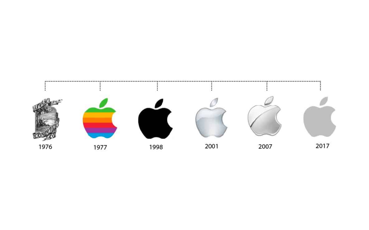
The Apple logo has undergone a fascinating evolution, mirroring the company’s growth and the technological sophistication it embodies. Initially featuring Isaac Newton under an apple tree, the logo quickly shifted to the now-familiar apple silhouette. First adorned with rainbow stripes to signify the capacity of the Apple II to generate graphics in colour, the logo evolved into a monochromatic apple, reflecting Apple’s sleek, minimalist design ethos. This evolution underscores Apple's focus on simplicity and innovation, key attributes that appeal to its customer base.
Instagram Logo
Instagram's original logo, a retro-styled Polaroid camera, reflected its initial focus on nostalgic, filter-heavy photography. However, as the platform expanded to include videos, stories, and direct messaging, its logo transformed into the current simple, gradient-filled camera icon. This shift signifies Instagram's growth from a photo-sharing app to a comprehensive social media platform, aiming for a more modern and scalable appearance.
Twitter Logo
Twitter's logo started as a simple, cartoon-like wordmark "Twitter" with a blue bird perched on one of the letters. Over the years, the logo was refined to just the bird, now known as Larry the Bird, which has become more streamlined and abstract. This evolution from a literal representation to a more symbolic one emphasizes speed and ease of communication, core features of Twitter's service.
YouTube Logo
The YouTube logo has seen subtle but significant changes since its inception. The original logo featured the company name with "Tube" inside a red rounded rectangle, resembling an old CRT television. The updated logo maintains the familiar red play button but adopts a cleaner, more contemporary typeface. This change reflects YouTube's expansion beyond a simple video-sharing website to a vast media platform that includes music, live streaming, and original content.
Yahoo Logo
Yahoo’s logo has transformed several times, moving from its quirky, eclectic roots to a more streamlined and modern typeface. The most recent update in 2019 introduced a sans-serif font and adjusted the exclamation mark’s angle, suggesting a forward-looking and adaptable brand, yet still approachable and whimsical.
Consumer Goods and Retail Logos: Amazon Logo
LOGIN
Login to read more!